q2. How does your Media Product represent particular Social Groups?
My media product represents a group of teenagers and young adults. It is a music magazine so I am targeting young, aspiring individuals, mainly from the UK, aged around 16-25 years old. It does that through the genre of my magazine. I represent this age group through my choice of model. I acquired a 17 year old white male, as this will be the majority of people reading my ‘pop’ magazine. The clothing I chose for my model was smart casual, this was to enhance the musician’s life. This helps the magazine relate more to the audience. The pose of the model and his gaze represents this particular social group as the representation of teenagers is troublesome, rebellious, disrespectful, lazy, moody, hate school , like parties, fun etc.
I was inspired by the character of Justin Bieber when creating the front cover. Justin is an idol for girls. He used to be sweet and innocent but now he has grown up to be more easily agitated, aggressive and reckless. He has changed his image and he does a lot of illegal stuff of the kind that ‘bad boys’ do, but people still adore him. That is a very typical characteristic of pop stars. They start as innocent anonymous singers and then when they get famous they turn into angry and rebellious people that the media crave.

I have used the The hypodermic needle model to understand the representation of my product. This is a model of communications suggesting that an intended message is directly received and wholly accepted by the receiver. The young people see the contents of the magazine and immediately get the idea of a cool and exciting world that exists inside the magazine’s papers. I have incorporated music news on my cover as this is typical news in a music magazine. This helps the reader know what types of articles to be expecting.

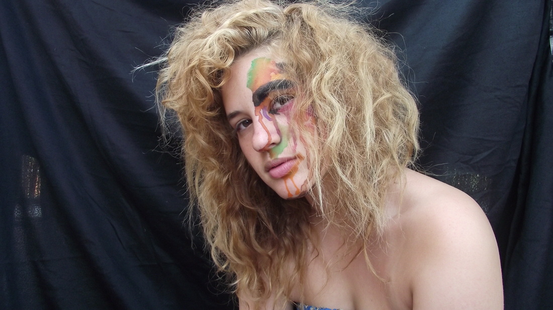
The main image on the double page spread presents a similar ideology as the main image on the front cover. The female model wears minimal cloths and her face is covered with paints.
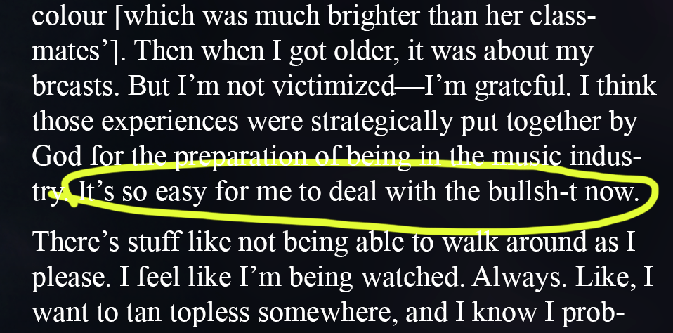
The language used in my media product represents the social group that I have chosen. I have incorporated swearing on my double spread page as this is a typical feature of the pop sub- culture as they do not care about what they say or people say, for example: “It’s so easy for me to deal with the bullsh-t now”. Anger and free speach is one of the connotations of the pop culture.
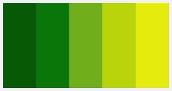
The colour scheme I have chosen for my magazine is grey, neon green, blue and red. The connotation of these colours are self-confidence, power, elegant, mysterious, sexy, stylish, , fun, chic, and trendy. These colours are unisex so they will appeal to males and females at thye same time. Therefore the market of my magazine will not be as niche as if I was to only target pop females.